CSS Training in India:
CSS stands for Cascading Style Sheets. It is the language used to style and visually enhance the structure of content on webpages. Think of it as the “clothing” of a webpage—it determines how elements like text, images, and videos appear on a page.
CSS is used to style and format the appearance of webpages. It controls the layout, colors, fonts, spacing, and positioning of elements on the page. CSS also enables responsive design, ensuring that websites look good on different screen sizes and devices. When combined with HTML, CSS helps create attractive, well-organized websites, while JavaScript adds interactivity to enhance user experience.
CSS is important because it enhances the visual appeal and usability of websites. It separates content from design, allowing developers to maintain the structure of a site while styling it independently. CSS works alongside HTML and JavaScript to make websites visually appealing, interactive, and user-friendly, making it an essential tool for web development.
Application:
CSS is used across various industries, particularly in web development, digital marketing, and design. Companies in technology, e-commerce, education, and media rely on CSS to style and enhance their websites, ensuring content is visually appealing and responsive. It’s essential for graphic designers and UI/UX professionals to create aesthetically pleasing and user-friendly interfaces. CSS is also crucial for content creators in publishing and blogging, as it helps present their work in an engaging and organized way. Essentially, any business with an online presence uses CSS to improve the visual presentation and user experience of their website.
Course Highlights:
CSS Foundation:
- Introduction to CSS
- CSS Selectors
- CSS Properties
- CSS Layouts and Positioning
- Styling Text and Fonts
- CSS Colors and Backgrounds
- CSS Box Model
- CSS Best Practices
CSS Advanced:
- CSS3 New Properties and Techniques
- Responsive Web Design with CSS
- Advanced CSS Animations and Transitions
- Flexbox and Grid Layouts for complex designs
- CSS Variables for reusable styles
- CSS Preprocessors (Sass, LESS)
- Custom Media Queries for specific device targeting
- CSS Accessibility for better visual
Duration:
- 30 Hours Theory
- 25 Hours Practical
- 20 Hours Project work
Technical Features:
CSS Foundation
Introduction to CSS
- CSS, which stands for Cascading Style Sheets, is the standard language used to style and design webpages. It defines how the content displayed by HTML appears on the internet, such as text color, fonts, layout, and spacing. CSS consists of rules called selectors and declarations, which apply styles to HTML elements. For example, a heading’s font size is adjusted using the `font-size` property, and the text color is changed with the `color` property.
- CSS is essential because it tells web browsers how to present the content in an aesthetically pleasing way. It allows for consistent design across multiple pages and websites by separating content structure from design. Another important feature is the ability to create responsive layouts that adjust for different screen sizes using media queries.
CSS Selectors
- CSS selectors are the building blocks of styling webpages. They consist of a selector, properties, and values. For example, `p {color: blue;}` targets all paragraph elements and applies the color blue. Common selectors include element selectors (e.g., `h1`, `p`), class selectors (`.class name`), ID selectors (`#idname`), attribute selectors (`[type=”text”]`), and pseudo-classes (`:hover`). These selectors allow you to apply styles and organize the appearance of elements on web pages.
CSS Properties
- CSS properties provide additional styling instructions for an element. They are written inside curly braces, like `p {color: red; font-size: 16px; }`. In this example, `color` is a property that changes the text color, and `font-size` sets the size of the text. Properties modify the appearance or layout of elements, such as setting colors, margins, padding, or font styles. They are used to control the visual presentation of HTML content on a webpage
CSS Layouts and Positioning
- CSS layouts and positioning help arrange elements on a webpage, making it easy to design structured and organized pages. Using properties like `display`, `position`, and `flexbox`, you can control the layout of elements. For example, `display: flex;` enables flexible layouts, while `position: absolute;` allows you to position elements precisely within a container. These techniques help create responsive, dynamic, and well-organized designs, allowing for smooth navigation and an improved user experience on various screen sizes.
Styling Text and Fonts
- Styling text and fonts in CSS involves applying different properties to modify how text appears on a webpage. You can use the `font-family` property to change the font, the `font-size` property to adjust text size, and the `color` property to change the text color. Additionally, properties like `font-weight`, `line-height`, and `text-align` allow you to control the boldness, spacing, and alignment of text. These styling techniques enhance the readability and appearance of text, improving the overall design and user experience.
CSS Colors and Backgrounds
- CSS colors and backgrounds are used to enhance the visual appearance of elements on a webpage. You can apply colors using the `color` property for text and the `background-color` property for elements’ backgrounds. Additionally, the `background-image` property allows you to add images as backgrounds, while `background-size` and `background-position` control the image’s size and placement. These properties create a more engaging and aesthetically pleasing experience, giving your webpage a dynamic and appealing look by adding depth and contrast through colors and backgrounds.
CSS Box Model
- The CSS box model is used to define the layout of elements on a webpage. It consists of four parts: content, padding, border, and margin. The content is the actual element, such as text or an image. Padding is the space between the content and the border, providing breathing room. The border surrounds the padding, and the margin is the outermost space that separates the element from others. Understanding the box model helps control the spacing and alignment of elements, ensuring a well-organized and structured layout on the page.
CSS Best Practices
- CSS best practices include writing clean, organized code, using proper selectors, and ensuring styles are efficient and reusable. Use semantic class and ID names to improve code clarity. Always keep CSS modular by separating different styles into external stylesheets. Avoid inline styles and use shorthand properties when possible to reduce code size. Organize your CSS with proper indentation and include comments for better readability. Additionally, use responsive design techniques, like media queries, to ensure your website works well on all devices. Minimize the use of overly specific selectors and validate your CSS to avoid errors.
CSS Advanced
CSS3 New Properties and Techniques
- CSS3 introduced new properties and techniques that enhance web design and functionality. Properties like `border-radius` create rounded corners, while `box-shadow` and `text-shadow` add depth and effects to elements. CSS3 also introduced `transition` and `animation` for creating smooth, interactive animations and effects. The `flexbox` and `grid` layout systems provide more flexible and powerful ways to arrange elements on a page. Additionally, `media queries` enable responsive design, ensuring a seamless experience on various screen sizes. These new techniques make web design more dynamic, efficient, and visually engaging.
Responsive Web Design with CSS
- Responsive web design with CSS ensures that a website adapts to different screen sizes and devices, providing an optimal user experience. It utilizes flexible layouts, such as flexbox and grid, to adjust the arrangement of elements. CSS media queries are used to apply different styles based on the device’s screen size, ensuring that the content is readable and accessible. Images and other media are also resized or adjusted to fit various screen dimensions. This approach ensures that websites look great and function properly on smartphones, tablets, and desktops.
Advanced CSS Animations and Transitions
- Advanced CSS animations and transitions enable interactive and dynamic effects on a webpage. You can use the `@keyframes` rule to create complex animations, such as moving or fading elements. Transitions allow you to smoothly change property values, like color or size, when an element is hovered or clicked. With `transition` properties, you can control the duration, timing, and delay of effects. These techniques make your site more engaging by adding movement, visual interest, and smooth interactions, enhancing the user experience.
Flexbox and Grid Layouts for complex designs
- Flexbox and Grid Layouts in CSS allow you to create complex, responsive designs with ease. Flexbox enables elements to be arranged in rows or columns, distributing space and aligning items dynamically. With properties like `justify-content`, `align-items`, and `flex-wrap`, you can create flexible layouts that adjust to different screen sizes. CSS Grid provides a more robust layout system, allowing you to define columns and rows for precise placement of elements. Both Flexbox and Grid are powerful tools for building modern, adaptive designs that make complex layouts more manageable and responsive.
CSS Variables for reusable styles
- CSS variables enable the use of reusable styles across a webpage. You can define a variable with a `–` prefix, like `–primary-color: #3498db;`, and apply it throughout the stylesheet. This allows you to maintain consistent styling, such as colors, fonts, or spacing, and makes it easier to update styles globally. By using CSS variables, you reduce redundancy and improve maintainability, as changes to a variable automatically reflect across all instances where it is used, ensuring efficient and scalable design.
CSS Preprocessors (Sass, LESS)
- HTML APIs like Geolocation and Web Storage provide extra functionality to websites. Geolocation allows websites to detect the user’s location, like showing nearby places or services. Web Storage lets websites store data on the user’s device, like saving login information or preferences, so users don’t need to re-enter them every time they visit a site.
Custom Media Queries for specific device targeting
- Custom media queries allow you to target specific devices and screen sizes, ensuring that your website adapts perfectly across different environments. Using media queries, you can apply styles based on factors like screen width, height, resolution, or device orientation. For example, `@media (max-width: 600px)` allows you to adjust the layout for smaller screens such as smartphones. Custom media queries enable responsive design, ensuring that your site provides an optimal viewing experience on desktops, tablets, and mobile devices. This approach enhances user experience by tailoring content and layout to different screen specifications.
CSS Accessibility for better visual
CSS accessibility ensures that websites are visually accessible to everyone, including users with disabilities. To improve accessibility, CSS provides properties like `color`, `contrast`, and `font-size` to ensure content is easy to read for people with visual impairments. You can also use the `: focus` pseudo-class to highlight interactive elements for users navigating via keyboard. Additionally, providing sufficient color contrast between text and background enhances readability for users with low vision. By applying these CSS techniques, you can create a more inclusive and accessible user experience for all visitors.
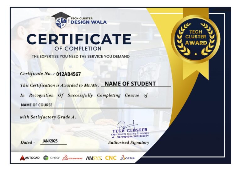
Certifications
V-Ray Certification Training
About V-Ray Certification Training in Indore at Tech Cluster


